
Making Maps
How simple maps help us navigate and shape our complex reality

Hi! This is my second essay, and I’m trying to improve! I would love some feedback on length, topic, and level of detail. Thank you so much in advance!
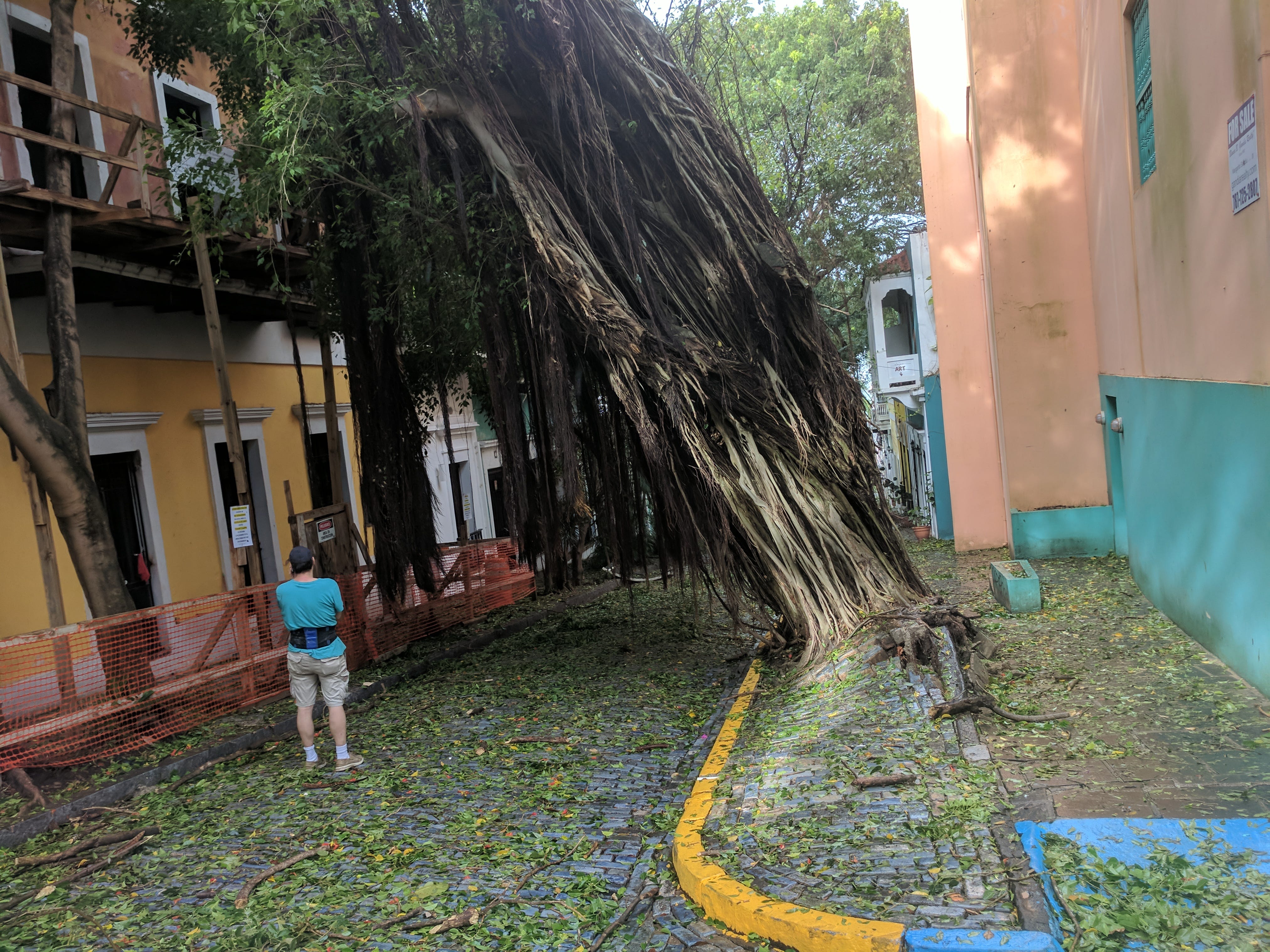
In 2017, Hurricane Irma approached San Juan, Puerto Rico, where I was visiting my friend Giancarlo. Despite sunny weather, some people in the center of Old San Juan were boarding up their windows with metal sheets, others were ravaging the shelves at Wal-Mart, and yet others were planning their route to a shelter.
“The government map is missing half the shelters”, Giancarlo said. “Their map doesn’t include school shelters. Can you help make a better map?”
He showed me what the government of Puerto Rico published.
It was slow.
It was missing data.
And it didn’t work on a phone.
Not great for an impending hurricane. So, I figured why not. A lot of our friends in Puerto Rico were public servants. Maybe they would find it helpful.
We spent a few hours putting the data together, building a simple site. It felt like a small thing, just something to do while waiting out the storm. He tweeted the link; I texted it to my friend Ruth who worked for Puerto Rico’s 311 center.
A few hours later, the wind howled louder, the pattering of the rain became a drumbeat, and the lights flickered.
Irma had arrived.
And Ruth stopped responding to my text messages.

Maps are Subsets of Reality
A map is a living document of our world. Reality is complex. A map picks interesting pieces. Layer by layer, a map reveals stories. Where communities gather, how diseases spread, how to move resources. Each overlay adds depth to our understanding.
I needed to select the components of Puerto Rico’s reality relevant in a hurricane. Three years before, I worked for Code for America and the government of Puerto Rico. So I knew exactly where to look for the data.
I had a whole menu - elevation models, zoning regulations, road quality - hundreds of potential overlays on the same map. I picked flood zones to show areas to avoid. Shelter locations (including schools that serve as shelters), and their phone numbers, so people could find the closest one. Roads to get to the shelters.
I picked up pieces from reality, put them together, and created a roadmap for what could become several survival stories.
Maps Turn the Abstract into the Concrete
Just like reading a book, a map can take us to a different world. I’ve never been to Pakistan. But from my laptop at a coffee shop in San Diego I can fly through the streets of Karachi. I could understand light pollution in Khyber Pakhtunkhwa. I could fly around a 3D image of K2, the second highest mountain after Everest.
A map makes a place more real. More tangible. With a map, Tolkien took us on a journey with Frodo. C.S. Lewis showed how Cair Paravel stands over Narnia. George R.R. Martin revealed the placement of the North and King's Landing in Westeros. A map reveals how parts of a world relate to each other.

But we don’t have to go to a fictional world to get lost in a map.
As hurricane Irma approached Puerto Rico, our map “concretized” the abstract concept of impending rain and flooding by showing where it’s likely to happen. Using the overlay of flood zones (new info) over streets (reference, familiar info), Puerto Ricans could reason about their level of risk at their location. They were able to make better plans for when the storm hit because they had a better idea of what to expect.
Maps Lie
Every map is a lie. To draw the map of a spherical object, such as Earth, on a flat surface we would have to flatten the Earth, or “project” it.

The world map that hangs in every classroom is the Mercator Projection - one of hundreds of ways to make a three-dimensional Earth into a two-dimensional map.
Like every projection, it lies. Countries near the poles look larger. Greenland is 1/10th the size of Africa, but looks the same size on a Mercator map. Compare that to Gall-Peters - an alternative projection:

The Mercator is the image our mind’s eye see when we think of a “world map”. But it represents continent of 1.4 billion people, and 30 million km2 the same as an island of 55 thousand people, and 2 million km2.
You read that right.
Big. Lie.
This slightly, just slightly makes Africa seem less important. So just imagine how this distortion echoes through trade policies, aid decisions, even personal choices about where to travel or invest.
Distorted projections are just one way maps bend reality. When we transform our world from three dimensions to two, highlight or omit features, or even choose a color scheme - we’re not just simplifying. We’re sculpting perception. Sometimes, we do this for usability. Other times, these are intentional decisions that benefit politics, business, or other agendas.
All maps lie - the question is whether they lie to illuminate or to obscure.
Maps in the hands of many
Maps reflect the priorities, boundaries, and values of their creators, shaping how they understand the world around us -- or how they want us to perceive the world.
Borders—simple lines on a map—can have far-reaching consequences.
Iraq and Syria are in perpetual turmoil because of poorly drawn borders by Imperial powers. China and India clash over South Tibet. The US walks a tightrope with “strategic ambiguity” about Taiwan. Even map providers offer different versions of the same map to cater to opposing worldviews1. Maps in China and India show different borders.
Maps inform decisions, influence policy, and impact future generations.
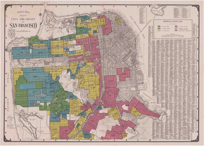
Red lines drawn on a map by banks in the 1950s robbed generations of African Americans of real estate wealth. They created pockets of “poor” and pockets of “rich” by withholding home loans.
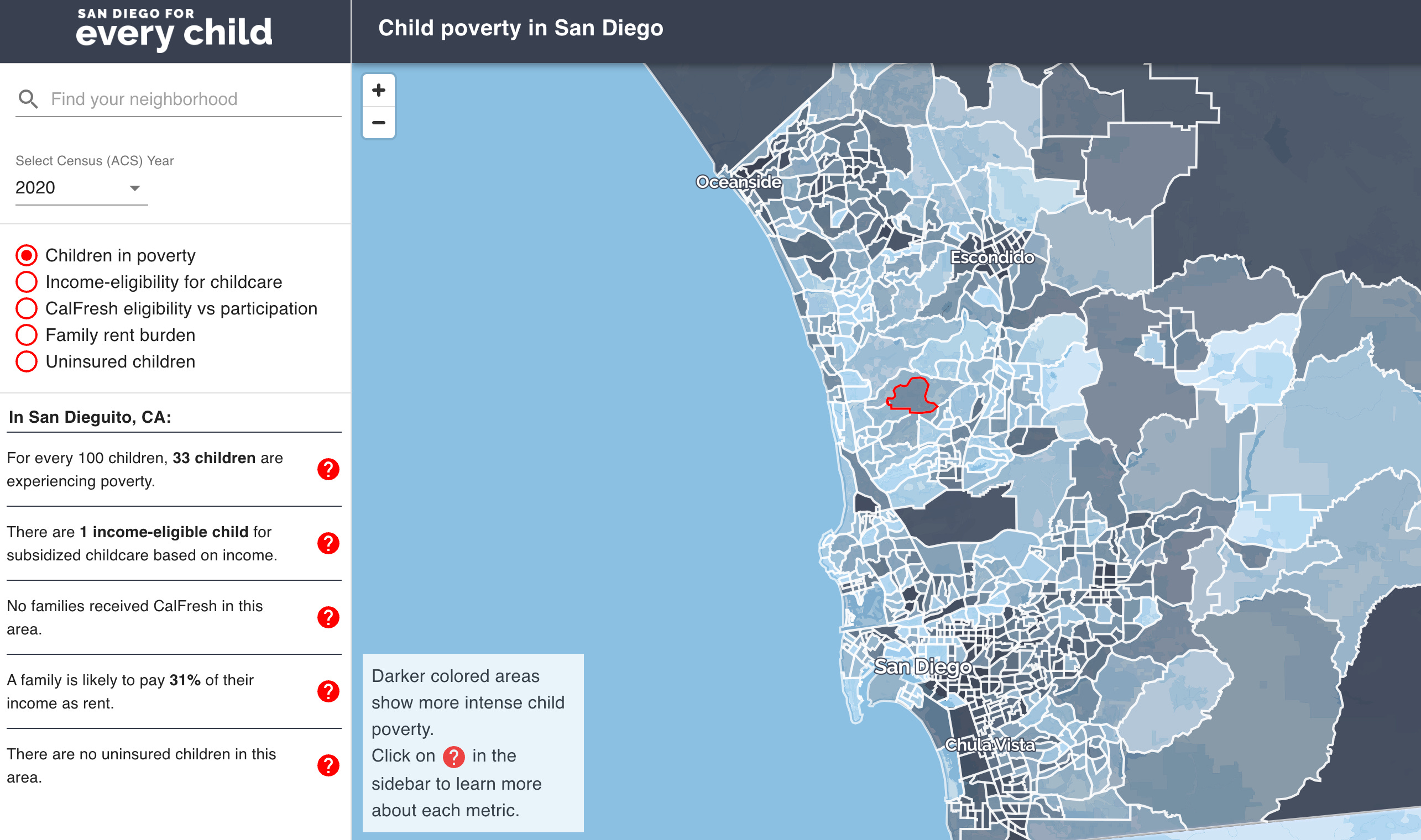
But maps also help us to fight the legacy of bad decisions from past decades. San Diego Child Poverty Map2 highlights disparities and pushes for change. Maps like these highlight the hidden, and bring together communities to drive action.
Like all technologies, maps are just as likely to be used for good as for bad. At the end of the day, the impact of a map is in how we choose to use it.
After the Storm
The morning after the hurricane, I left Giancarlo’s house and walked around Old San Juan. The morning sun shone on battered rafters and cobblestone streets covered with fallen trees. As I watched residents walk around and assess the damage, I was still waiting for responses to my “are you ok” texts to friends, Including Ruth. I was getting worried.
After a few more hours, I finally heard from Ruth. The calls to 311 spiked as soon as the hurricane started, and she hadn’t been able to respond to my texts.
She told me the center used the map we made to direct people to safety. They had access to the same data I used, but it was too hard to put it all together, so they used our map.
Her words humbled me. It took us a few hours to make that map. A fun side project. A simple map. Yet, by subsetting reality, concretizing the abstract, and putting the map in the hands of many, we helped people when they needed it most.
Maps - rich with data, alive with patterns - show us where we are and where we could be. They reveal problems we need to solve and opportunities we never knew existed.
Maps help us find our place in the world. They also help us shape it.
Hi! This is my second essay, and I’m trying to improve! I would love some feedback on length, topic, and level of detail. Thank you so much in advance!
"Maps - rich with data, alive with patterns - show us where we are and where we could be."
I love how you highlight the importance of free-thinking along the way. A map might try to tell us and others where we are, how much "space" we take up, etc but at the core we decide how we orient ourselves.
Thank you for bending my mind this AM.
…it’s a mic drop seeing the differences the world looks like map to map…amazing what we hide from ourselves with the images and truths we show each other…what an artform the map…i have a buddy who made one of his hometown that was only magical places of interest…great read maksim…